December 31, 2019
Power BI: Basic Things Not to Be Missed (Desktop Version)

Power BI is undeniably one of the leaders in business analytics. Its service provides interactivity in visualization and is powered by its business intelligence capabilities such as its own formula language DAX (Data Analysis Expression) and data preparation through its Power Query.
In this article, you will be equipped with basic know-how to start using Power BI. If you are a long-time Excel user or an avid fan of Excel, you’re most likely to love this business intelligence tool which is sometimes referred to as data visualization tool.
Getting Data

Power BI can connect to dozens of data sources either on the cloud or on premise. In fact, the most common data sources like Excel, Text/CSV, and SQL Server are easily accessible by going to the home menu then get data. Some sources let you connect by selecting only the files you want to be imported and some require you to input credentials before accessing the data.
In data connectivity mode, you have the option to select Import or DirectQuery. Selecting import will result in all data downloaded on Power BI’s internal cache for it to access upon the development of dashboard or report. On the other hand, DirectQuery is the live connection to the data source. This option saves space and RAM usage but it definitely needs a lot of processing power and fast connectivity.
Data Transformation

Once you have identified the files or connected to your preferred data source, it’s now time to transform the data according to your reporting and dashboarding needs (it is very rare for data to be consumed without any transformation or cleaning).
Upon clicking the transform data button at the bottom of the navigator window, the Power Query Editor window will show up. Sound familiar? Yes! This is basically the same Power Query technology that can be found in Excel but this is a much improved version.
With Power Query, you can do powerful things to transform the data based on your preference. There’s a bunch of transformation techniques you can do for each column of your table such as remove, add, replace values, split column, group by, and pivot. All these and more are accessible when you right click each column.
Some must-know data transformation techniques:
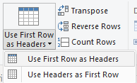
Use First Row as Header

Let’s admit, sometimes when you import data, header is usually treated as the first row. With this very simple technique, your problem is solved.Transform Data Column

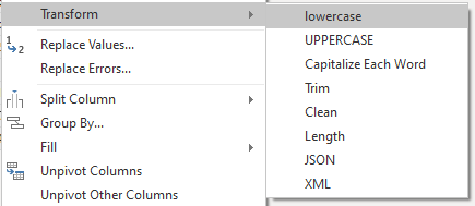
With this handy option, it’s so easy to change all the characters at once into lowercase or uppercase. Similar with trimming data for leading and trailing spaces, cleaning data to remove non-printable characters, and Capitalize Each Word for quick professional looking of proper nouns.Pivot/Unpivot Column

Under the transform menu of Query Editor, you’ll find two gems called pivot and unpivot columns. These two are helpful when you need the column values to be converted into rows (unpivot) or row values to be converted into columns (pivot).Split Column

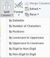
It is common to see data compressed in a single cell within a row. To solve this problem, you need to split the characters by a specific pattern, either by delimiter, number of characters, position, and many more.Change Data Type

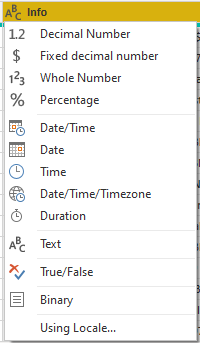
Changing data type is very intuitive with Power BI’s Query Editor. You can directly change the data type of each column by clicking the data type icon before each column name and select your desired new data type.Data Statistics (numerical data only)

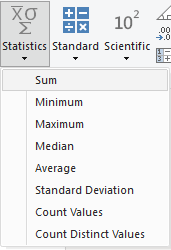
If ever you are curious about the basic stats of numerical columns, just use the statistics feature under transform menu.
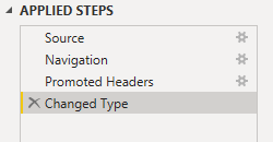
Power Query Editor has its own documentation of every action you applied within the dataset. This can be found in applied steps at the right side of the Query Editor window. You have the control to delete a step or edit its settings.
Moving forward to the add column menu, these are the three main ways of adding a new column:
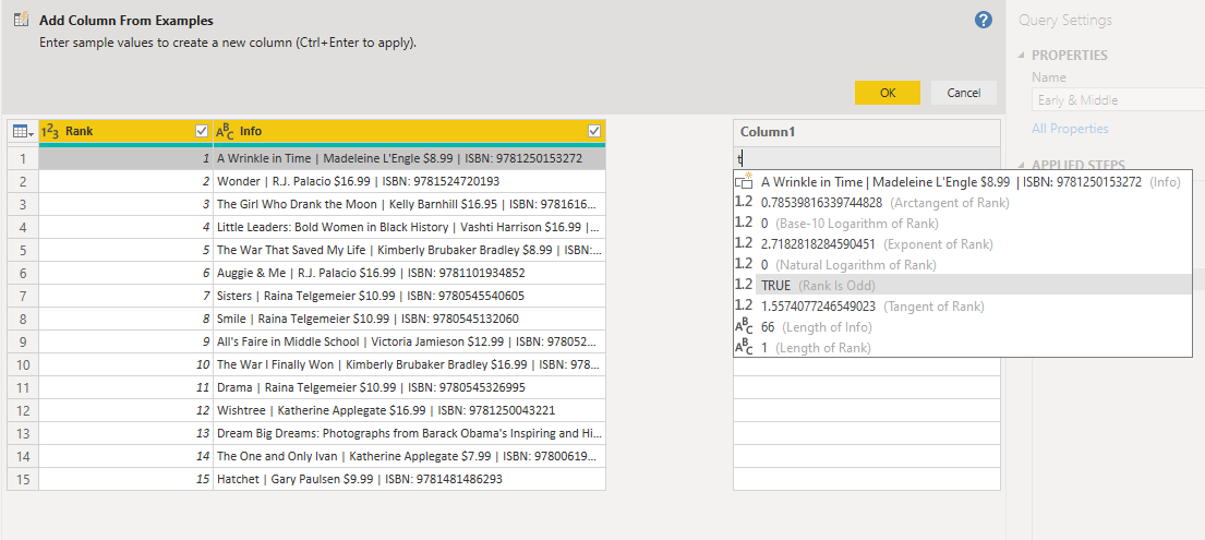
Column From Example

This option is intelligent enough to detect what you want to do. Just select which of the options fits your needs.Custom Column

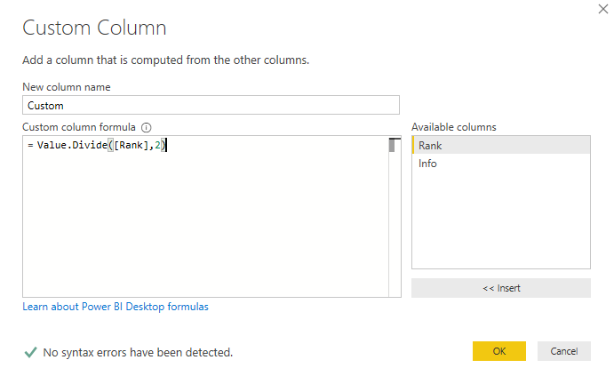
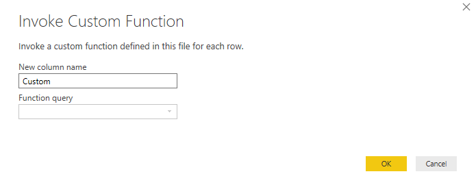
The custom column option lets you create new columns using user-defined formula. Data that met the criteria specified within the formula will be filtered .Invoke Custom Function

This option is used whenever you have a query that you want to pass in a parameter to be fed on each row which is dynamically calculated.
Data Modeling

At the left side of the Power BI Desktop, go to the model tab indicated by an icon of tables connected to each other. This is the feature of Power BI wherein you have full control in the relationship of each table. Using drag-and-drop capability, just drag the field you want to connect with other fields of other tables and set their relationship (1-1, 1-many, many-1, many-many).
You can also right click at the line connection and manually set your table relationships.
Dashboard/Report Development

https://i.ytimg.com/vi/Zy8TlxDeSlw/maxresdefault.jpg
On the report tab (bar chart icon), this is the place where you put all your insights in a graphical representation for the audience to consume easily.
To start off, you need to identify which fields you will need to create a chart. From these fields, you can try several charts to see fit based on the data presented. But that’s not the best practice for it. For further reading on which chart you should choose in presenting an insight, head over to this link.
Additionally, you can add custom charts to spice up your dashboard if the visualization in your mind can’t be achieved by the default visualization of Power BI. Go to this link to download visuals you want to incorporate in your dashboard or report. Just be sure you are signed-in using your corporate or school email address to be able to download.
Under the modeling menu, you can find three extremely powerful features to add intelligence and dynamic analytics to your reports and dashboards.
New Measure & New Column - Measures and calculated columns both rely on DAX expressions. They differ in the context of calculation or evaluation. Measure is used on a report level usage. You can only see the effect or output of the measure when it is used in a visual like matrix table. For calculated column, you can instantly see the result which is based on row-level within a table. Both of these are sensitive to any filters applied during data transformation.
New Table - when you want to create a table with dynamic values or you need to control the values via DAX, this option is suitable for you. One common usage of this is the creation of date table for Power BI. By creating your own custom date table, you are not stuck to the limitation of the Gregorian calendar.

On the fields section of Power BI Desktop, you will see the organized collection of tables you previously imported and their associated columns (also known as fields). For each field, you can further augment something based on it like creating a hierarchy (geographic location, organization, etc.), renaming, and even applying quick measure (collection of most commonly used calculated functions).
You’ll spend most of your time using these three options available for each visualization. From left to right, they are called: fields, format, analytics.
Fields - This is where all your selected fields for a chart can be found. Fields can be placed in several places like in values, details, legend, or tooltip. You can also quickly aggregate them just by right clicking each field placed.
Format - All those detailed aspects of a chart that you want to change like font, font color, alignment, conditional formatting, and a lot more are all residing here. You can also turn on/off specific aspects like legends and axis.
Analytics - This option is only available to selected visuals (any form of bar charts, area charts, line charts, scatter plots). Leveraging this option lets you create those min, max, or average lines to set some context for your visual.

Heading to the view menu, the bookmark and sync slicer option are handy in enhancing the user experience of your reports and dashboards.
With bookmarks, you can save a state of the report (let’s say no filters selected) and apply it on the button object you placed in your dashboard. Though you can’t see the effect right on the Power BI Desktop itself, once you published your dashboard on the cloud or on premise via Report Server, you’ll see that bookmark is a very good trick to hide and show specific content of your dashboard.
The sync slicer let you manage the visibility and behavior of data filtering across the pages. This is useful if you want the filter from one page to be synced with other pages as well.
These are all the basic things you must know for navigating through Power BI Desktop to create reports and dashboards with stunning data visualization and to help you to do some tricks in content creation. There’s more to know on the deeper and more technical aspects of Power BI, but the knowledge above is enough to get you started and help you feel comfortable in using this tool.
